Making Zoho People better for its people;
through user experience
.png)
Goal
The goal of this project is to restructure Zoho People and integrate useful features backed by research and insights from users and interviews.
Duration
October 2023 - November 2023
4 Weeks
Personal Project
Deliverables
User Experience Design
User Interface Design
Initial Hypothesis
-
Employees spend a lot of time performing tasks on zoho which ideally shouldn't take long
-
They are using the application out of compulsion
-
Features are hidden and nested
-
They are unaware of their employee benefits which keeps them from making informed decisions
Target Audience
-
Companies using Zoho
-
Employees using Zoho
-
Small and mid sized companies in need of and HRIS platform
Problem Statement
A lot of time is spent figuring out how to perform tasks, where the information is stored and in actually performing tasks too! This leads to the users having a bad user experience and causes additional frustration over and above
their existing work pressure in the office.

Stakeholder Mapping

Insights
The stakeholders were identified and placed based on their importance and value exchange among them;
going from Primary to Tertiary from the inside of the bulls eye.
Secondary Research
Insights on the primary research done and the relevant data collected
1. Core Functions: Payroll, benefits administration, time and attendance tracking are key functions performed on an HRIS system
2. Benefits Awareness: 83% of the employees are unaware of employee benefits
3. Customization Needs: Employees and companies look for customization in these systems
4. User Base: Zoho has over 641,713 companies using its products and services

Competitive analysis

Insights:
1. We can clearly see how Keka is really matching upto Zoho
2. While zoho may seem like its giving a lot of features, users aren’t exactly aware of them.
3. Neither are all the features useable in terms of information input and how they are structured
4. There is no integration between either of the apps with MS Teams or google meet
5. Details of benefits are not disclosed to the employees. Zoho despite having the feature fails to communicate this.
6. No platform offers a reimbursement system which allows clear communication between both parties and is hassle free.
Primary Research
Insights on the primary research done and the relevant data collected
1. 82% of the employees said that the hr manages their benefits and they are mostly unaware of the details
2. 9 of 21 people faced issues in performing tasks on zoho
3. 90% people only use zoho for checkins and timesheets
4. 71% users find the task of filling hours, time consuming
5. 67% users use google calendar for scheduling client meetings
6. 20% users are unaware of employee benefits all together
7. 57% users fill time logs weekly despite the company asking them to do so daily
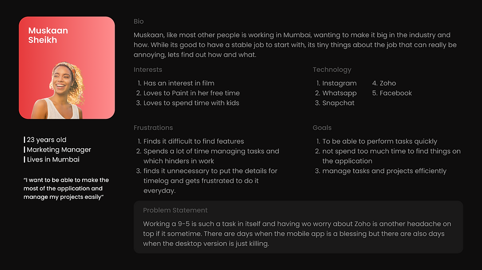
User Persona
User Testing
Conducted a user testing with a regular ZOHO user to gain better insights and understand the core needs of an everyday user.

UX Audit Connect
I set up a meeting with Shravani and the Studio Lead of monsoonfish to understand the gaps of zoho between the management side and the employee side.
Shravani has also conducted a Zoho Audit in the past; insights of which were helpful for my project.

Restructured Information Architecture
Given the size of the Architecture, Its is advised that you click on the image to access the PDF and take a look.

Customer Journey Mapping

Empathy Mapping
.png)
Insights
The user feels isolated, ignored, and stuck using the apps for simple tasks. Her aim is to understand the platform
and not waste time figuring it out. Zoho must help them get things done faster, not slower.

The Revamp
Apply On duty (New Feature Integrated)

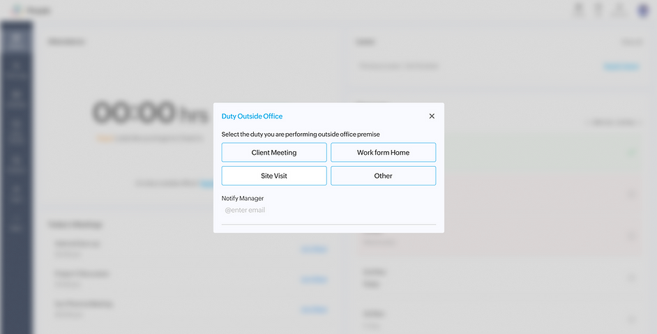
An addition to the dashboard which allows you to quickly notify your manager about the nature of work one may have outside the office.
Filling time logs
Out with the old

In With the New

The most dreaded part of Zoho; made simple. When in a state of hurry, or stress, having to think
of something you did in the morning and how how many hours can be frustrating unless you have
it written.
The redesign allows you to select from projects you are working on, and the flow is designed to guide you while also allowing you to have your job description the same as the assigned job; given that was
a use care many employees pointed out.
The dashboard
Out with the old

In With the New

The key aspects of the redesign of the dashboard include a cleaner user interface, actionable items upfront under each section such as "Apply On Duty" or "Add time log" and even "Apply Leave" which is next to the date of your last leave which gives makes you think a little before taking a leave.
Using visual cues like play of color to show the indication of a time log being missing for a day of the ongoing week or being done.
To have a look at more detailed comparisons between the old and the new, Click here to download the PDF